Christ Our Hope is a church in Wake Forest, NC. After a bad experience having a logo designed through the website Fiverr, They approached me about creating a logo that felt both fresh and modest and fit the mission and ethos of their congregation.
Their logo at the time was outdated and not working well for the applications they desired.
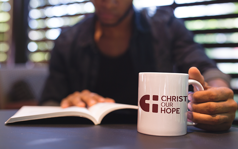
After receiving the completed client questionnaire, we developed five initial concepts to present. These provided a variety of styles and ways of representing the church’s mission and ethos. The church representative got feedback from others and they decided on which option to move forward with. This option (“Subtle Symbols”) incorporated the ‘C’ and ‘H’ from their name as well as the cross symbol into one simple logomark.
At this point, we began to refine the logo – this included subtle changes to the logomark, experimentation with font choice, and color options.
After refining the logo we looked at color choices. We presented the client options based on their general color interest and decided on the burgundy option.
The final logo is simple with understated strength. It scales well for various print and digital uses and provides a recognizable mark for outreach and congregational use.
We would love to have a conversation about how Third Lens might partner with your organization for your design needs.