Hope Chapel Case Study
Hope Chapel is a 12-year-old presbyterian church in North Carolina. An upcoming facility change prompted them to refresh their logo, aiming for something that felt warm and also rooted in tradition (their denomination is over 300 years old). They also wanted to simplify the logomark for better usability in social media and other digital applications. In addition to the logo, we also built them a large custom website.

While there was important symbolism to this original logomark, it was too intricate and complicated to display well in smaller applications, such as a social media profile. The text also felt generic and a bit too thin or lightweight.

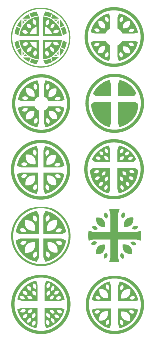
For the mark, we explored many varieties of the circle with cross. The church liked the idea of retaining the leaf imagery (grown, vibrancy) and also the nod to stained-glass window design.

In the end, we chose a mark which incorporated those aspects while scaling sizes well.

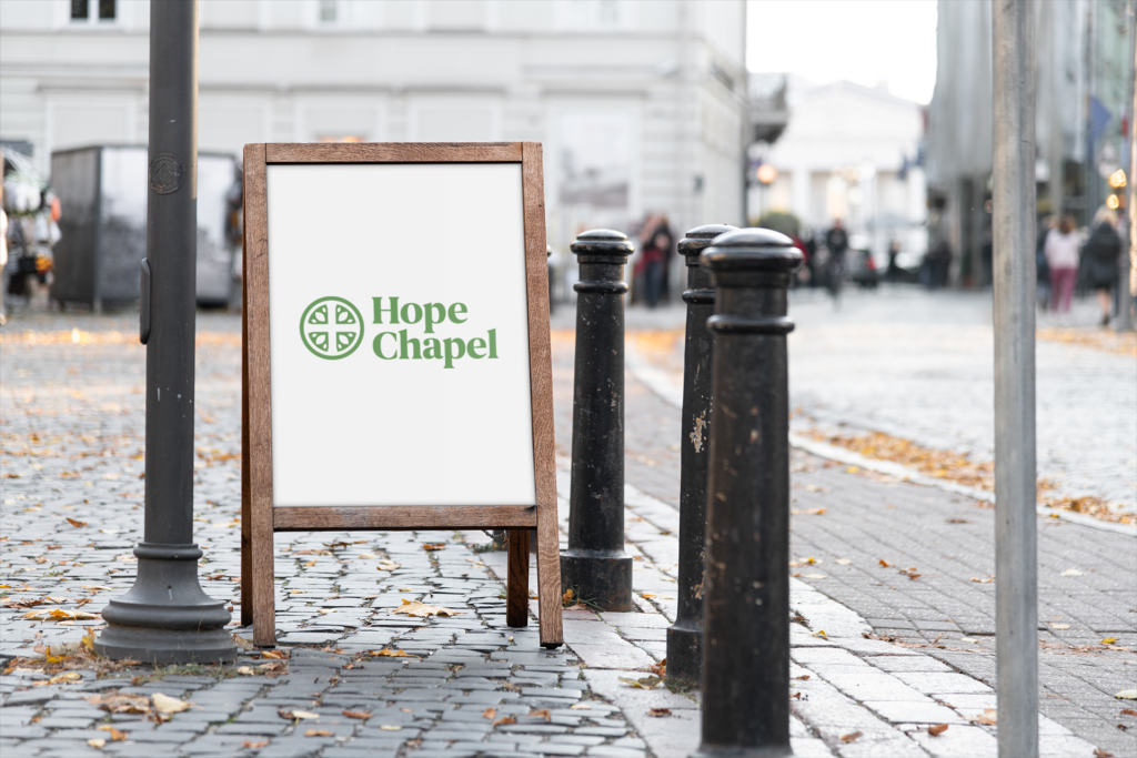
For the text, we decided to move away from the lighter, more generic sans-serif type, instead moving to a soft-edged serif. In addition to this bringing a bit of tradition and rootedness, this update also gave more warmth and personality. The church’s tag line was set in a simple, all-caps type that reads well at medium to large size. When the logo is used in smaller sizes, the tag line is omitted.


The result is a logo that captures the rootedness of their faith and tradition as well as the warmth and life of their God and people. It scales well to work in different sizes and applications and can be formatted several ways depending on its use.
We would love to have a conversation about how Third Lens might partner with your organization for your design needs.
336.207.1977
